

Judges: Lance Booth/The New York Times, Kate Bubacz/Buzzfeed, Brent Lewis/The Undefeated
Judges: Lance Booth/The New York Times, Kate Bubacz/Buzzfeed, Brent Lewis/The Undefeated
Get immediate access to NPPA's competitions, job bank, training resources and much more.
Judges Comments
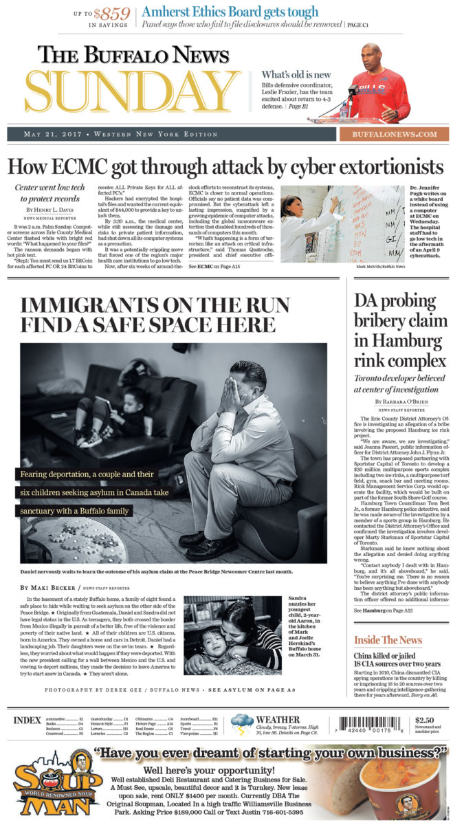
First Place: Clear winner. Kate: This is clean, its clear, its incredibly effective at introducing a topic via an individual without being overly saccharine. It is immensely respectful to the history of the story, and is a well-executed take on a classic approach for photojournalistic follow-through. Brent: Just wow! I am going to third what Kate said. Lance: All things Kate said. I completely agree. I think it is beautiful, well thought out, nice design, basically everything. Second Place: Kate: This story looks well at the aspects that define safety, especially for kids: food, a space to sleep, attention. That being said, this edit still acknowledges the precariousness of this safety. Brent: I love this story and I love the approach at telling it. Now it is just a little too much on the page and I would have like to have a little more space for the photos to breathe. Yet, I see what they were trying to accomplish with each page breaking down an aspect and providing some nice moments. Lance: I think this suffers from too many photos, but it is still well done. It is topical in today’s political environment. Beautiful story. Third Place: We didn’t agree on 3rd but all thought this could have been an HM; therefore it edged out our picks for 3rd. Kate: TBD (she thought it was pretty). Lance: Pages are very well done. I don’t think the images are repetitive, but the designer, in my opinion, did a fantastic job. Brent: I think it is beautiful while providing a nice amount of information in the photos. The double truck is stellar. It’s overwhelming when it needs to be, but pulls back when it needs too.